Case Study
Air Quality Life Index
The Energy Policy Institute at the University of Chicago helps translate global energy research into real-world impacts.
Engagement Overview
A Data Visualization Platform to Improve Global Health & Air Quality
The Energy Policy Institute at the University of Chicago (EPIC) is a global leader in helping governments and industry create more sustainable energy systems. With frontier research quantifying the causal relationship between air pollution and reduced life expectancy, EPIC’s team engaged Constructive to create The Air Quality Life Index, a groundbreaking nonprofit data visualization platform.
The goal? To make clear that air pollution is the greatest threat to human health and provide policymakers, leaders, and the public with the insights and tools needed to shape policies that mitigate the impacts of climate change and promote longer, healthier lives for all people.
Focus Areas
At a Glance
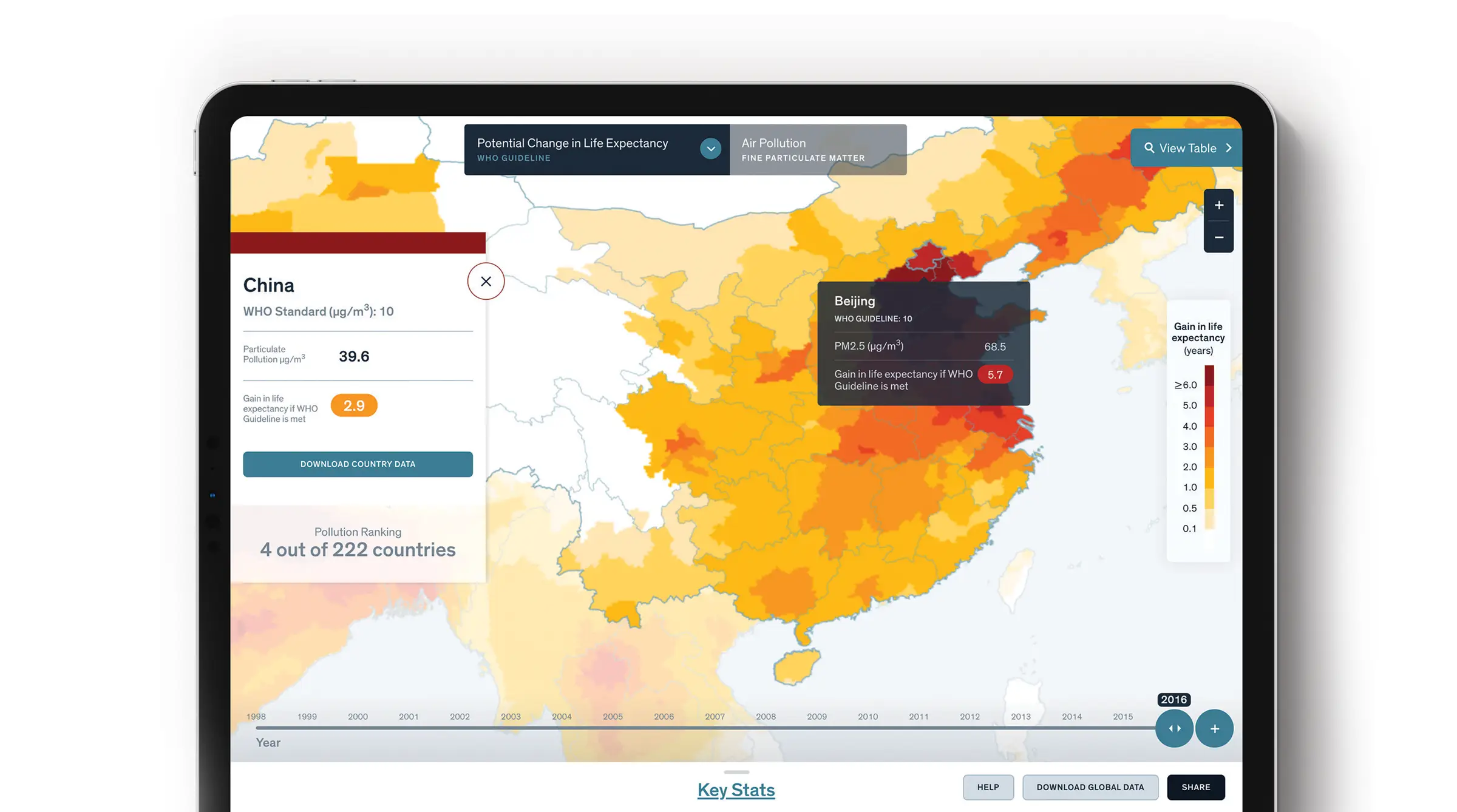
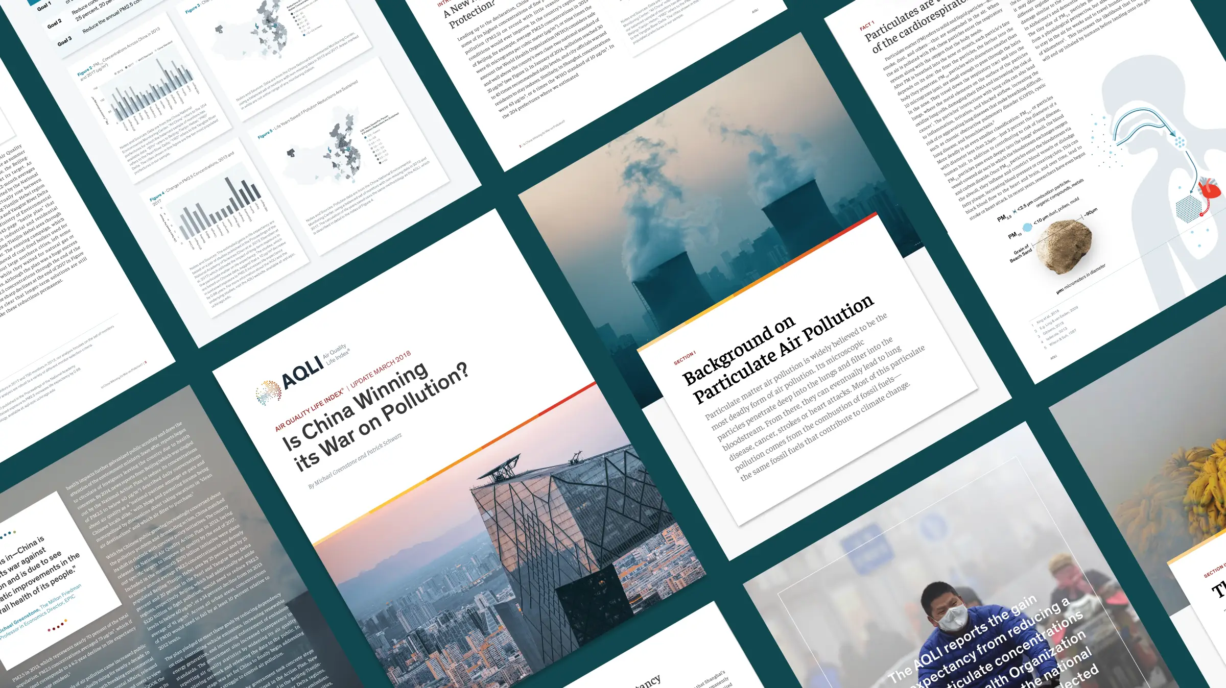
Visualizing Policy Impacts: The new tool was designed to create a visual narrative that connects air pollution policies from around the globe to the consequences pollution has on human life expectancy.
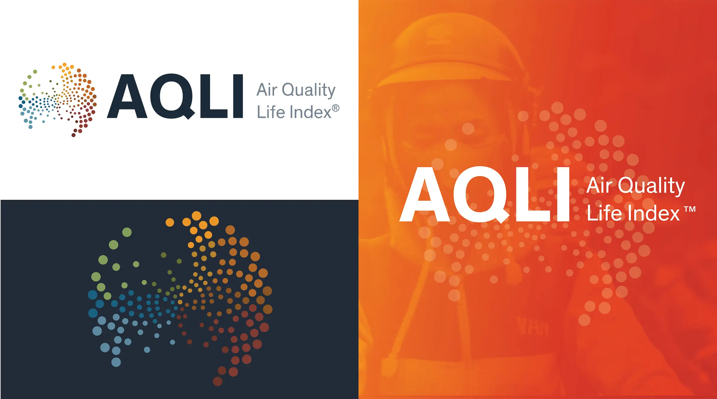
A Memorable Mark: The new logo uses a natural phyllotaxis pattern that expands as it creates the shape of a globe to signify both air particulate matter and the living world.
Designing for Print: To connect with policymakers and influential leaders across private and public sectors, we designed a system of research reports and fact sheets that could support informed decision-making, even off of the AQLI website and tool.
Digital Strategy
Communicating Complexity with Simplicity
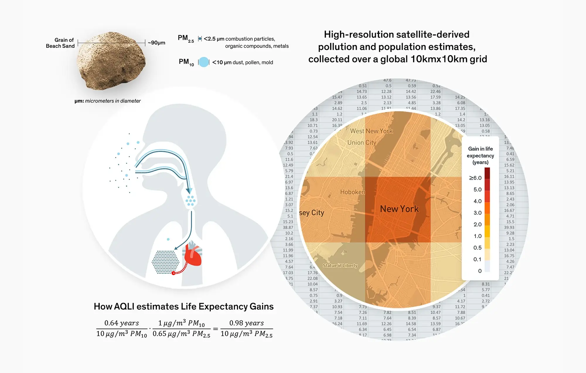
This groundbreaking tool would pull air pollution data from satellites and allow users to drill down by specific regions to see the current life expectancy there and compare if the air quality matches the World Health Organization’s quality for healthy air.
With this vision in mind, we knew that the tool needed to be accessible to a variety of users. Initiatives like the AQLI that are focused on complex scientific concepts and research face a steep challenge when the goal is to use data design to engage, educate, and empower a wide range of audiences. Experts demand depth and rigor—and are usually eager to dig into the details. Influential non-experts and the broader interested public typically want a more surface-level understanding and top-level takeaways that focus on the big picture.
We helped EPIC meet the needs of both audiences with a digital strategy that balances long-form and data-heavy content with editorial and design that quickly explain issues, the science of air pollution, and the AQLI’s method of measuring its impact on life expectancy.
Visual Design
Designing a Brand That is Quantitatively-Minded & Qualitatively Beautiful
In designing the Air Quality Life Index’s brand, we wanted a memorable mark that both reflected the brand’s scientific rigor and created an emotional connection. We started with design research exploring a range of scientific, mathematical, and geographic information systems mapping concepts.
Initial concepts focused on ideas to beautifully represent the AQLI’s global scale of air quality data and its potential for impact on global air quality and life expectancy. Dots arranged in a phyllotaxis pattern that expands as it creates the shape of a globe signify both air particulate matter and the living world, while a colorful array provides the AQLI brand with the palette needed to produce a rich assortment of
data visualizations.
UX Design & User Testing
Challenging Design Assumptions
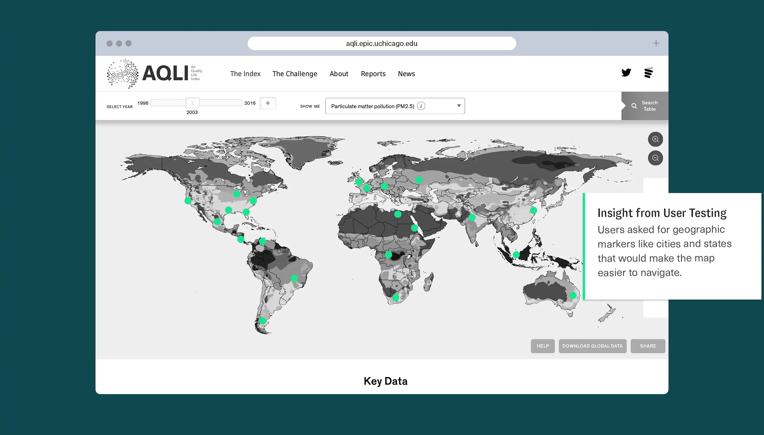
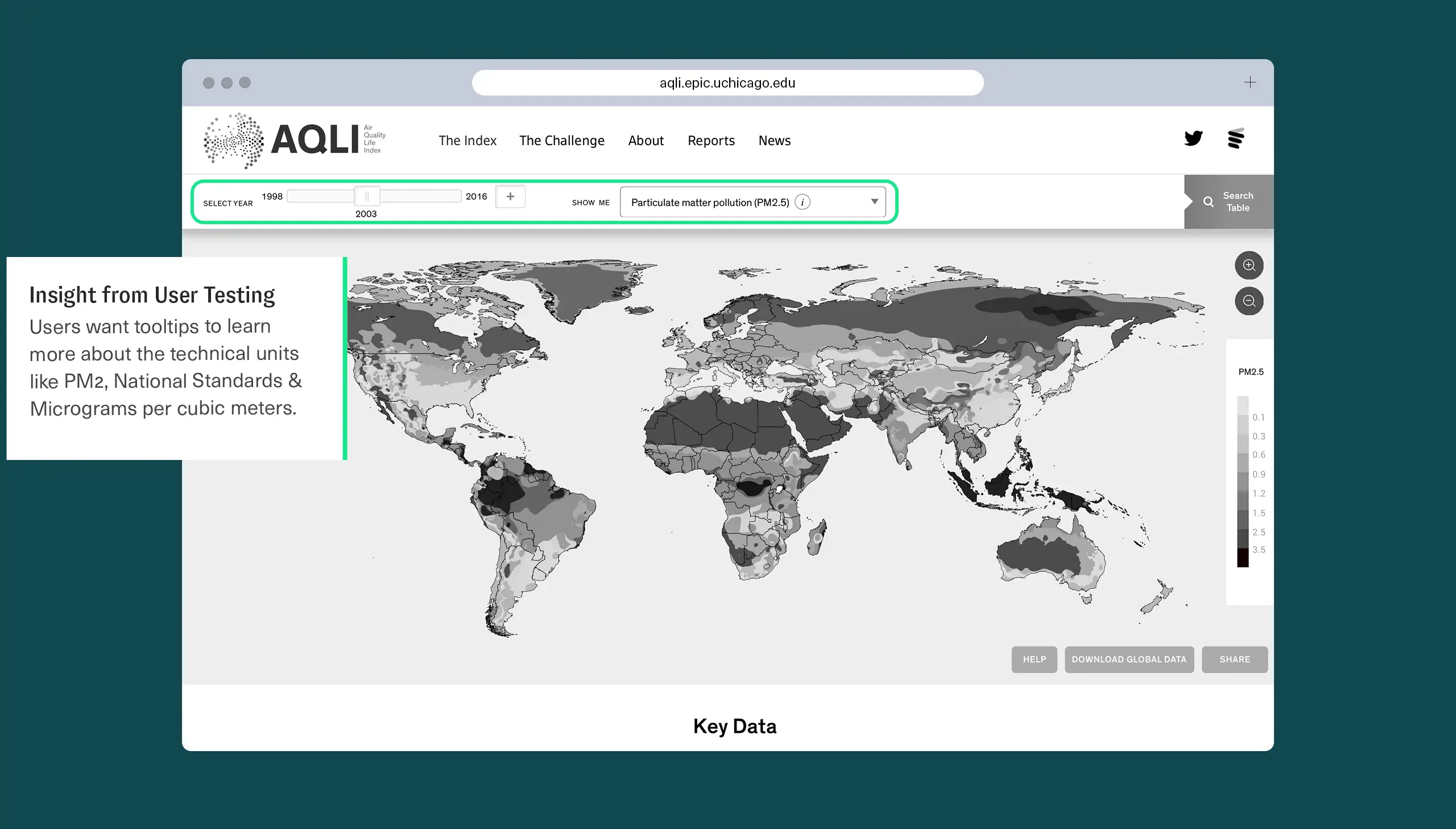
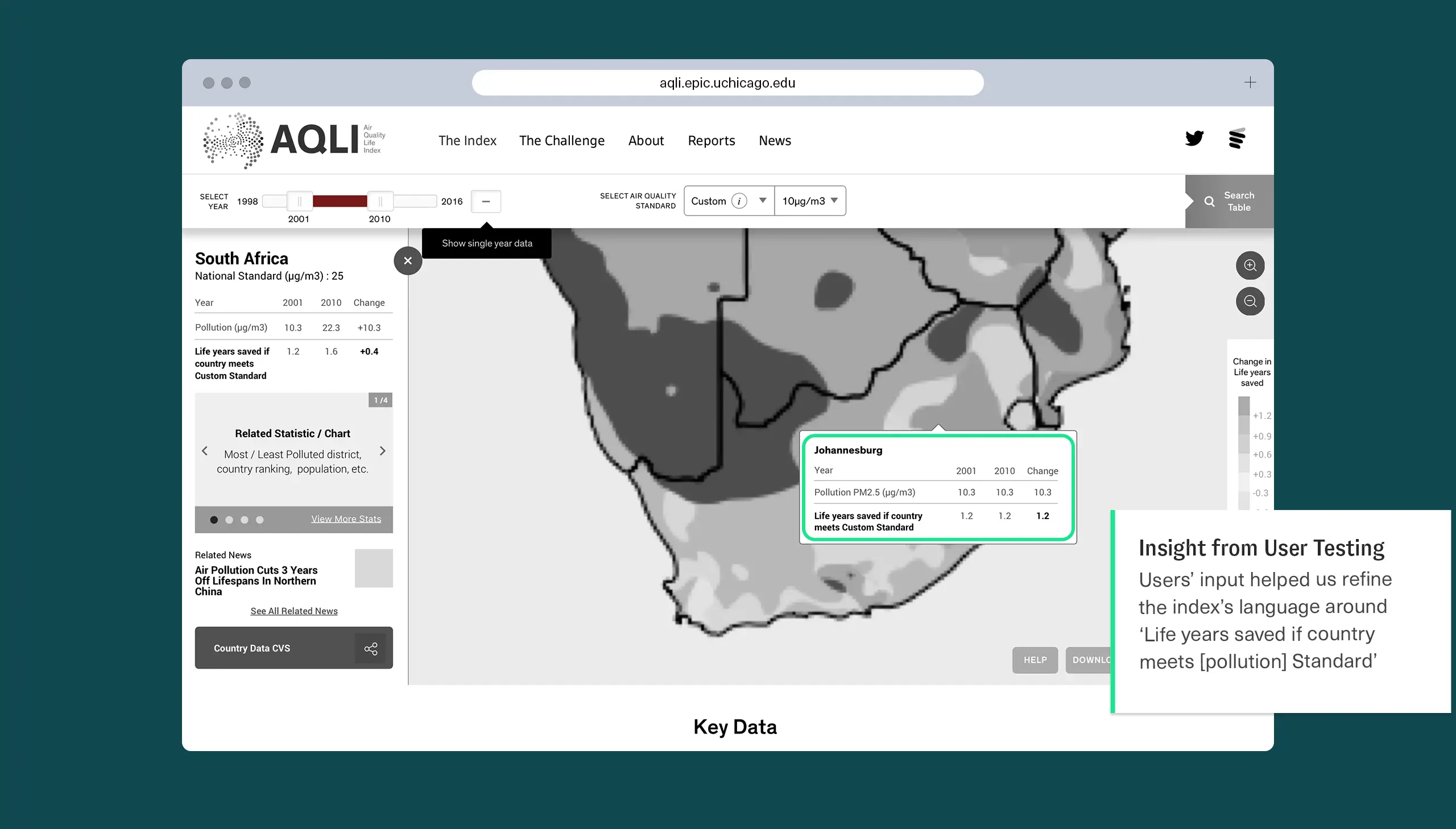
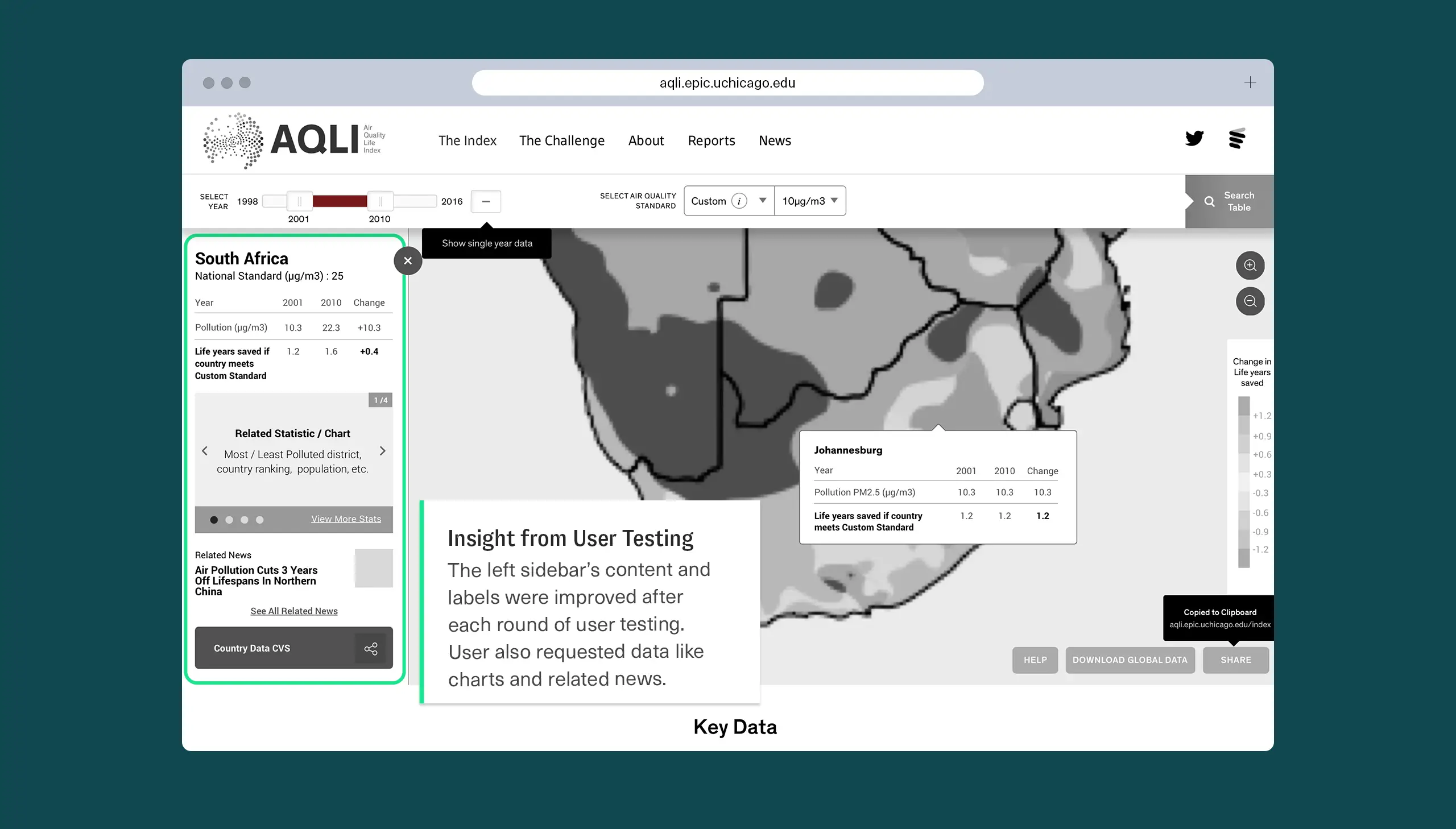
The core of the Air Quality Life Index is an interactive map that takes extremely high-resolution data and makes it accessible, allowing audiences to explore the research and test the findings. As a first-of-its-kind platform presenting new concepts, we needed to make sure the AQLI was not only fast and easy to use, but also expository—providing contextual clues to help bring users along. Throughout digital strategy and information architecture, we conducted user research and testing, gaining a range of insights and ideas that were then iteratively incorporated into the data visualizations within the platform.
“Constructive is far more than just a great design team. They’re strategic, creative partners with a knack for understanding complexity who help us communicate it simply and elegantly to multiple constituencies so that our efforts have greater influence. When it comes to turning complex research into compelling content, design, and data visualization that engage experts and policy-minded audiences, Constructive is the best in the business—which is why I’ve continued to work with them for a dozen years.”
Sam Ori
Executive Director, Becker Friedman Institute, University of Chicago
Website Design
Moving Audiences from Awareness to Action
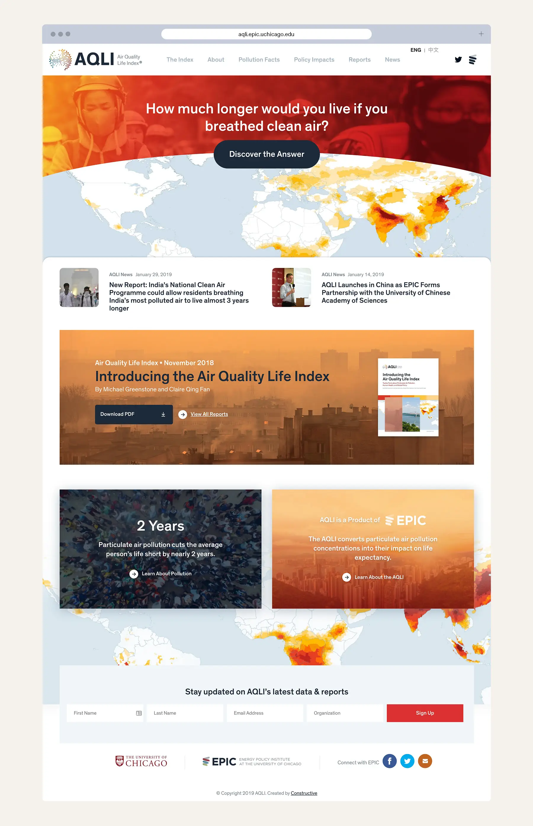
Data-driven social indexes like the AQLI carry a higher burden for effecting change than traditional nonprofit websites. They must both maintain an empirical, scientific perspective while delivering calls to action that speak to the significance of an issue.
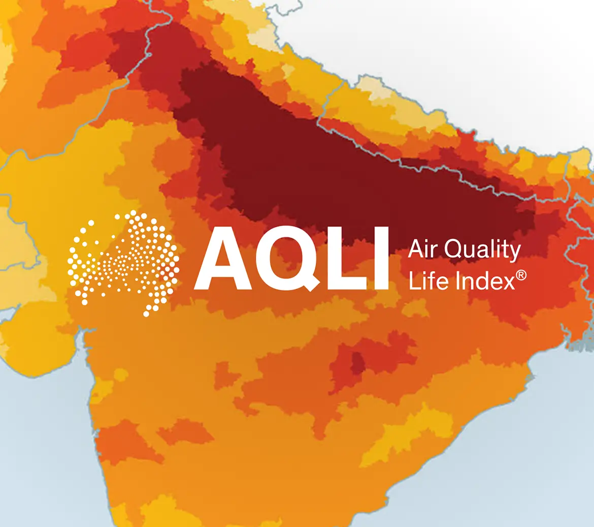
To help AQLI audiences cross the bridge from awareness to action, we designed the website and its interactive data tools to communicate urgency—leading with language that speaks to air pollution’s impact on human life, using “hot” color overlays that visually represent the threat, and using cool tones for the user interface, creating a calm environment for exploring the data.
Content
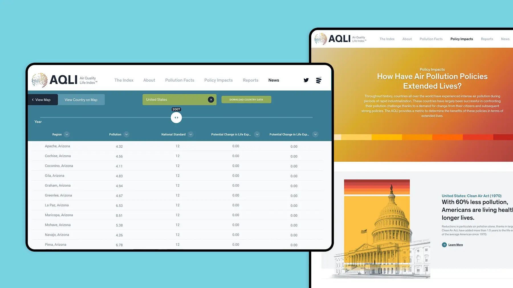
Showing the Impact of Policy Decisions
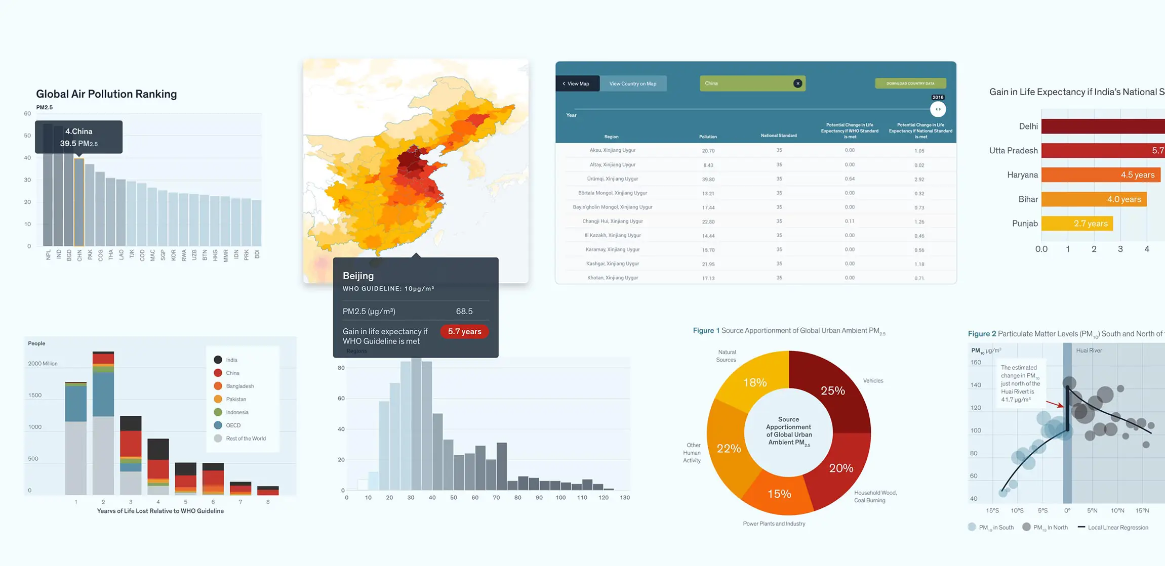
As with most large-scale social or environmental issues that require collective, cross-sectoral action, policy is often the most significant lever for change. The Air Quality Life Index adds to its value as a data visualization platform by providing historical context on the policies enacted around the world to combat air pollution and their impact. As a result, audiences are more knowledgeable about how environmental policies have played a successful role in the past—and can use this insight to more successfully advocate for additional ones in the future.
Content
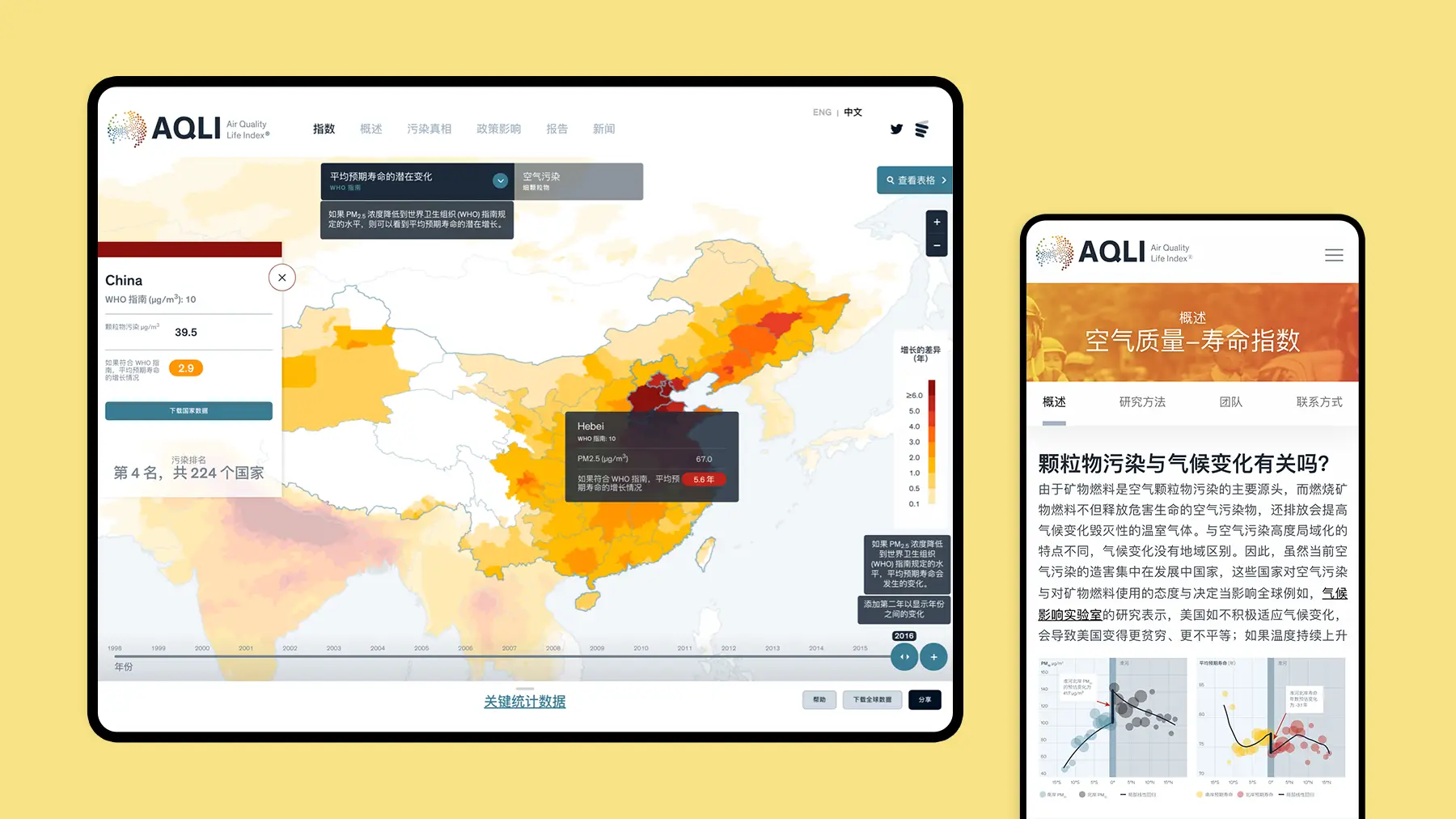
A Multilingual Design to Reach Countries with the Biggest Opportunities for Impact
The countries that produce the most air pollution are the ones that exist at a specific intersection: high industrial production and low environmental regulations. In the 21st century, this means that while America and the EU must provide leadership on reducing air pollution, the most significant opportunities for progress are in China, India, and Pakistan. The AQLI meets this challenge with a multilingual design, currently delivering experiences in Mandarin and with Hindi on the horizon.
Report Design
Designing for Key Stakeholders Who Still Prefer Print
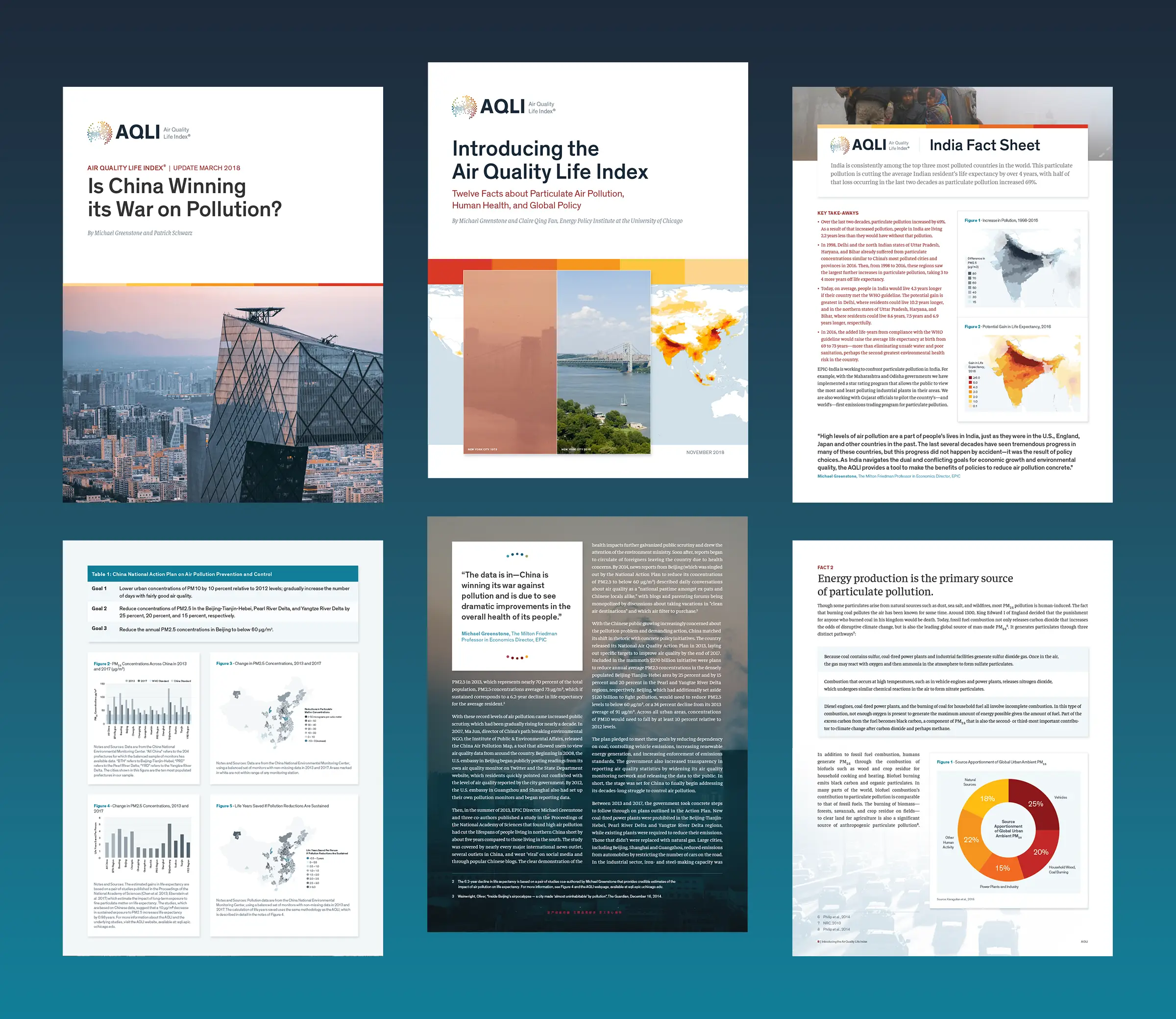
The AQLI’s core strength lies in its function as an environmental data research tool, empowering audiences to understand and act on the threats posed by air pollution. However, carefully constructed research reports still play an important role in helping both government policymakers and influential leaders in the private and public sectors make informed decisions.
To connect with these essential audiences, we designed a system of research reports and fact sheets for ongoing production of communications focused on global and regional environmental developments.
Featured Case Studies